

BIGLIGHT
Biglight LTD is a leading customer experience design agency based in London, UK. Biglight manage the UX/UI needs for a plethora of clients, namely: Adidas, Vans, Timberland, Hobbycraft, Furniture Village, Jimmy Choo, Euro Car Parts, George, and The North Face, to name a few.
As a UX/UI Digital Designer on the George account, I have had the opportunity to work with renowned brands like ASDA's George, but have also been involved in working on projects for other accounts in the company such as Yamaha Music and M&S. My role involves translating client briefs into fully fledged UI deliverables, ensuring that projects are delivered with speed and accuracy, whilst strictly adhering to user accessibility regulations. My work involves creating and updating assets for the George website and, app, as well as creating a multitude of emails for their daily sendouts, and creating motion graphics videos for Biglight's SMM channels.
Denim Landing Page

So this is the original Denim page that needed to be refreshed. The page was full of static elements which seem to stand alone from each other as independent creatives. The entire page was static and relied heavily on the yellow headings to bring energy and life to it, but these headings stole the spotlight over the actual products, and so the client wanted to strip back the design to make the products the focal point as opposed to the design elements.
Now because we design assets based on what we have in our Figma module library, usually there isn't much wriggle room to make something fresh and exciting, so at the time these product blocks were uniform and adhered to the set blocks found across the entire site.
Original Page Design:


New Page Design:
These are the initial design iterations that were sent over to the client to review before deciding which direction they wanted to move forward with.
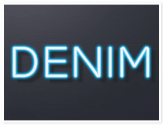
For this project the goal was to redesign the Denim landing page. The client gave a basic overview of what they wanted to achieve, and at the time were going through a rebranding process, in which the redesign had to fit with the style they were curating, (but one which had not yet been fully decided on) so this project consisted of a few iterations, many focus hours and cups of coffee until the clients finally found the glass slipper landing page design. The deadline to have it finished was tight. We had 2-3 days to turn around a fresh landing page redesign with multiple iterations. For this project, the layout featured modules that would require a different functionality than had previously been used on the George site for the same page, so I worked closely with the Dev team to accomplish this. Where before, the page had a static scaled-down version of the Desktop design, this time around, the images were to be larger and allow the functionality for customers to scroll through the blocks like a carousel. In the original design, each block was independent of the others as standalone modules, but I chose to unify the blocks to make the design look as seamless as possible when scrolling; Making the completed design look and feel as unified as possible.

Animated Assets:
The longest part of this project was turning the static denim lockup into a realistic glowing neon sign, whilst keeping the final deliverable file size under 150kb. I created the initial neon lockup designs in After Effects and found that it was nearly impossible to save the animation down to under the maximum file size allowance for our site without heavily compromising on the quality of the assets. After finding that it wasn’t possible, I opted to recreate the same animation, frame by frame using Figma, in which I spent a while crafting each layer of the neon glow to specific timings to make the neon sign flashes look as realistic as possible. Needless to say, this was the turning point in animating the lockup and keeping the file size under 150kb.


Blockers & Solutions:
Another blocker for this project was art-working the model shots to be featured on the page - removing background elements and cleaning up the edges of the models, and working with a difficult client that changed and swapped out images a few times throughout the project even after completing near finished iterations; But whilst creating the first round of model shots I had made a Photoshop template to help speed up any further additions.
The next blocker was ensuring that each of the rows consisting of 3 blocks, fit within our maximum site dimensions so that we didn’t have to completely reconfigure the site modules for this one project. The client finally agreed on one of the 5 iterations and the Developer and I managed to complete the task with hard work, perseverance and a little ingenuity. The final deliverables consisted of 2 different animations in 4 sizes for MB and DT, redesigned CAT banners for the landing pages (and any page that may direct customers to the main denim landing page) and 16 modules with designs that fit together seamlessly for the page blocks.


Final Design:
Overall the project went very well, and the client relayed amazing feedback to our team’s account manager and to the owners of Biglight, expressing how extremely pleased they were with the redesign, which was great to help strengthen Biglight’s relationship and ongoing partnership with George.
These are screen recordings of the final landing page and it's functionality across desktop and mobile.


Lingerie Landing Page

For this project, I was tasked to create a new layout for George’s Lingerie Landing Page. This involved creating a new look and feel for it, as well as constructing and wireframing a new page layout using blocks from our module library. The goal of this task was to be able to show off ranges and collections, as well as make it easy for customers to find specific products.
The original design of the page was quite restrictive and limited users to select from groups of styles, instead of being able to choose specific products or types of products. If you explore the George site you will notice that this page stands aside from the overall look and feel of pages seen across the site. The new brief was to make a lingerie page that fits the look and feel of the already existing site branding, in an effort to show more of the George lingerie range, whilst also making the lingerie page stand as it’s own entity within the site.


Design Iterations:
The toughest part about this project was studying the already existing pages on the site to decide which modules should go where in terms of heirarchy - leaving space for standout ranges to be showcased, as well as leaving enough room for the client to decide what they want put where. All of this as well as picking apart the L&F of the Lingerie page at that time, to ensure the page didn’t feel like it was deviating too far away from the current design, but instead revamping and expanding on what was already there.


Final Design:
The page design was well received by the client and my line manager. This is the page design that George has used for the past year and a half, up until the recent company wide rebrand. Below are screen recordings of the page when it was live.


Lingerie Fit Guide

Based on the success of the Denim page, I was tasked to team up with the same developer and create new assets and functionality for George’s newly added Lingerie Fit Guide. For this project, because I already had experience working with the developer to craft new module functionality for the Denim blocks, we had figured out what works and how to replicate that same style with new custom sized blocks. The client provided an outline of how they want the new look and feel to be. I was tasked to study the page design and create a new “Lingerie Fit Guide” based on the brief and requirements. Below you will see the redesigned Fit Guide.


Being a UX/UI designer on the George account, a key aspect of our daily responsibilities involves crafting engaging email campaigns for diverse rollouts and daily marketing. We meticulously design each email to ensure optimal user experience and brand coherence, driving successful campaign outcomes.

Social Media
Prior to working at Biglight, the majority of roles had been primarily Motion Graphics based. So upon pivoting to the UX/UI arena - being that I'm the only person in the company with video editing and motion graphics experience - that experience has played an integral role in diversifying Biglight's social media presence, as well as help the CEO and senior members of the company when doing presentations and pitches to secure new clients. Below you will find a few of the motion graphics projects I've created.


